Finland Scandinavian School at the heart of South Jakarta

Located in Cibis Park, South Jakarta, Masa Kecil school is opening their second branch as an extension of first branch in Kemang. The group owner came to us, wanted specifically for Finnish interior style as they wanted to create a cheerful and playful based education school for its student.

As soon as you entered the school, you will be welcomed with a Huge Tree of Knowledge that we built in and connecting with Library. The main idea for the Library is to a thirst of knowledge, encouraged children to spend their time more in a library with a wave book rack and air balloon bench. The Montessori Hall is functioned as the main hall, as it held for spesific events most of the time.

We also designed the Gym room Facade on the back of the building, providing a spacious play space for toddlers & baby to exercise their gross motorics. Everything is covered with mattresses to ensure its safety

Interior Design & Build : Graha Irass Interior (December 2022 - March 2023)

Facade & Landscape Design : Cibis Park team

Civil & Interior ceiling & partition : Bpk Ary

ME & HVAC : Bpk Arif

Mendesain toko retail elektronik dengan banyak kategori

Ketika mendesain toko retail terutama Showroom (toko dengan banyak kategori di dalamnya), beberapa hal fundamental yang harus diperhatikan adalah :

  1. Flow berjalan untuk pengunjung.
    Pastikan space / jarak antar aisle / lorong bisa di masukan trolley / keranjang belanja. Minimal jarak adalah 90cm - 120cm supaya ketika ada pengunjung dari arah sebaliknya berjalan di dalam lorong, tidak bertabrakan dengan pengunjung arah lainnya

  2. Section

    Ketika mendesain showroom elektronik retail dimana banyak kategori didalamnya, layout harus disesuaikan dengan kepentingan users dalam mencari kategori tersebut. Ini mempengaruhi peletakkan produk di kategori berdampingan dengan kategori lain yang semacamnya. Misalnya Kategori Air Conditioner, di dekatkan dengan kategori Air Purifier. Kategori TV di dekatkan dengan kategori Laptop & Handphone. Kategori Kompor didekatkan dengan area Kulkas. Peletakkan kategori berdasarkan fungsi ruangan, memudahkan customer dalam melakukan pencarian barang sekaligus memperbanyak kesempatan pembelian impulsif dalam toko. Misalnya : ketika customer datang untuk membeli Kompor, mungkin mereka akan teringat untuk membeli Cooker Hood dan Blender / Juicer.

    Secara pribadi, saya tidak begitu menyukai pembagian section berdasarkan brand. Karena tidak semua brand memiliki varian produk yang bermacam - macam. Selain itu, ketika sebagai pengunjung, kita mau mencari mesin cuci, kita harus berpindah pindah tempat untuk melakukan perbandingan apabila showroom di bagi berdasarkan brand. Sangatlah merepotkan!

  3. Lighting

    Pastinya kalian sudah tau bahwa toko yang gelap tentu saja tidak “inviting” atau mengundang. Karena itu pastikan toko retail mempunyai penerangan yang cukup dan bagus. Untuk suasana yang hangat, pilihlah lampu Warm White dan lampu sorot (Spot light / bisa memakai track lamp sorot) ketika ingin menghighlight produk penting di display

  4. Simple Design

    Yang perlu di ingat ketika mendesain toko retail adalah “the product is the champion”. Jadi jangan sampai desain interior displaynya mengalahkan produk itu sendiri. Display interior seharusnya menjadi pendukung agar produk terlihat menarik. Karena itu, display interior untuk toko retail diharapkan sesimple mungkin, dengan meminimalisasi penggunaan warna yang Bold / ngejreng supaya tidak mengalahkan aura dari produk yang akan di display. Pilihan warna putih / kayu dapat menjadi pilihan simple minimalis

Contoh Implementasi dari AJS Electronic Showroom di Jalan Panjang, Jakarta Barat

Design & Build : @grahairassinterior

Project Completed : 2020 (1 month design process, 2 months implementation)
Recyclable Plastic Bottle Exhibition with Sejauh Mata Memandang at Plaza Indonesia

Together with Laut Kita production, Sejauh Mata Memandang has brought to you the exhibition of “the effect of plastic usage to our ocean”. The exhibition itself has been designed by Mata Production Agency and within 20 minutes walk, you will be brought to the journey of how our plastic usage has affected our ocean severely. For the store itself, we are consistently using bamboo as a replacement material. And in the ceiling, we installed the ceiling rigid where the used plastic bottles are hung from the top. The store itself will be opened until end of June. ! Its been a pleasure working with this brand, together for our environment!

Store Installation by : Graha Irass Interior

Plastic Bottle Recycle by : Laut Kita Production

Designed by : Mata Studio

Papilion Duo, Plaza Senayan

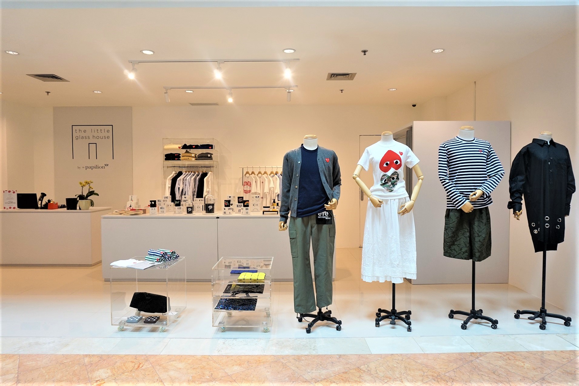
The 1st pop up stores ever done by Plaza Senayan, Papilion Duo is aiming to charm the customers with Curated Pop up retail, stores. As a brand, Papilion Duo is more than just the sum of its designer's products – housing an eclectic mix of books, designer shoes, fashion accessories, and ready to wear from some of the world's most coveted designers. Aiming to emphasize on the clothes, we are using Acrylic as substance to create perfect deal where you need balance in terms of colours and patterns and an illusion of more space. 

Sejauh Mata Memandang

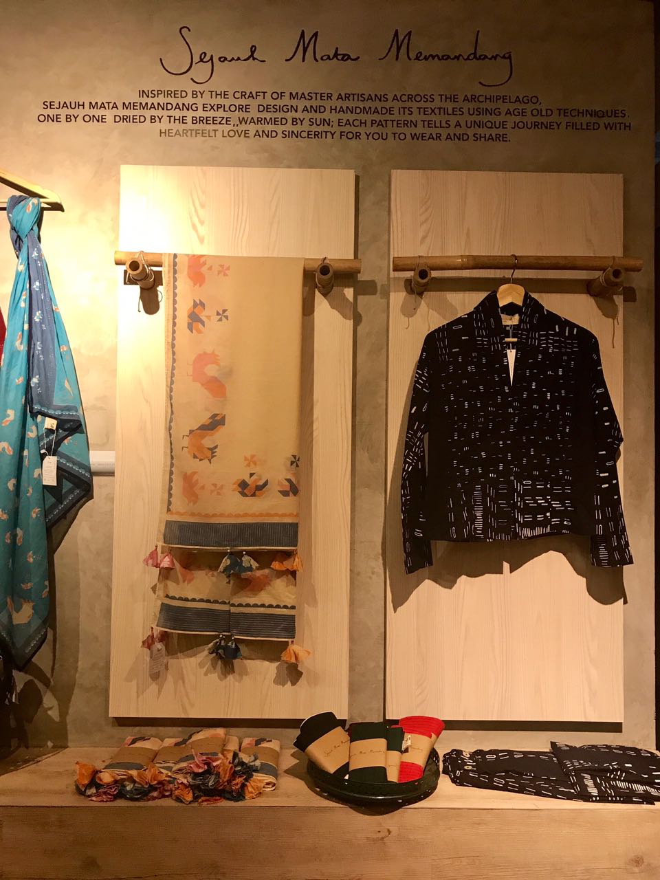
Just like the philosophy behind the label, Sejauh Mata Memandang is aiming to inspire their free spirit minded customers with their design. Bamboo as textures has not strangely used and always been our indonesian heritage when it comes to use it as base structures. With this campaign, we rolled out the same concepts in two of its pop up stores in Dia.Lo.Gue Kemang and The Good Things in Life, Terogong.

Implementation in Dia.Lo.Gue Kemang

Implementation in The Good Things in Life , Terogong

SF Capital & InvestMe - Satrio Tower Building, Kuningan

Located in prestigious Satrio Tower Building in Kuningan, SF Capital decided to open its first head office in CBD Area. As Investment & Finance Consultant, the owner wanted to hold on to image of professionalism that are mirrored in the design of its conference room & director's room while maintaining the fun loving area for its staff. Space is designed to have merged with its sister company with more youth & energetic feelings. The spaciously appointed CEO’s office, discreetly positioned in the back of the office. The space comprises 2 main desks, four-person meeting table and 2 sofas for greeting and more relaxed guests. . Designed & Built by PT Graha IrassLestari

BEFORE CONDITIONS

3D IMPRESSIONS

iMPLEMENTATION

Heritage Factory Outlet, Bintaro Jct & One Bel Park

Heritage is well known factory outlet brand, started & established in Bandung, Heritage became an icon for Bandung especially a must tourist visit. Heritage has opened its branch in Bintaro & One Bel Park, Lebak Bulus. Designing the place to meet the needs for number of displays but still attractive enough for the section to be highlighted, we renovated the kids’ section by playing colourful color and lighting. Sales has gone up more than 15% since its renovated.

Harrn & Thann

Harrn & Thann

Harrn & Thann is a wellbeing home spa who offers range of skin & body care products. Harrn & thann plaza Indonesia is one of the flagship store as extension of the spa centre in Plaza Senayan. Shop is designed to create atmosphere with Asian holistic approach and dominated with dark – wood material selection to create the same relaxed & restoration feeling as customers enter the spa centre. The furniture such as the lampion lighting & red display are initiating the originality of the products dominated by Asian culture

Read More

Petit Papilon, Kemang

Petit Papilon, Kemang

Papilon is iconic urban building where arts, fashion, beauty and fascinating niches meets & interacts in forms of shops, salon, bars & restaurants. We designed & built the interior for high end designer kids collection in Petit Papilon. The shop not only offering a fashion collection for the kids, but also a concept of playground that is form with the playhouse with mattress & pillows, encouraging kids to come play into the shop.  

Read More

Papilon Duo, Plaza Indonesia

Papilon Duo, Plaza Indonesia

The Papilon Plaza Indonesia is a pop up store extension of Pacific Place shop where mixes of fashion emerging brands such as Celine, Louis Vuitton and any limited-edition brands comes into one place. The luxury products are highlighted with the simplicity of the design interior of the shop. The selection of the materials & colour for the clothing rack, the cabinets are accentuating the products sold in the shop.

Contact us for consultation

Read More