Apartment Fitting Out at Skyloft+ BSD

Decorating a house doesn’t have to break the bank. This Project is a form of LOVE from Father to a Son, that are going to the university nearby. He wanted his sons to save time from commuting and focus on his study instead. He bought this apartment, hoping his son can stay here and also lent the rest of the rooms to his son’s friends

From the beginning, our client has set on the budget and wanted us to add on a little creativity to light up the apartment so have its own quirkiness. one of the ideas is to be clever with the wallpainting, creating a curved form as part of bedhead and add a little bit of Mauve colour.

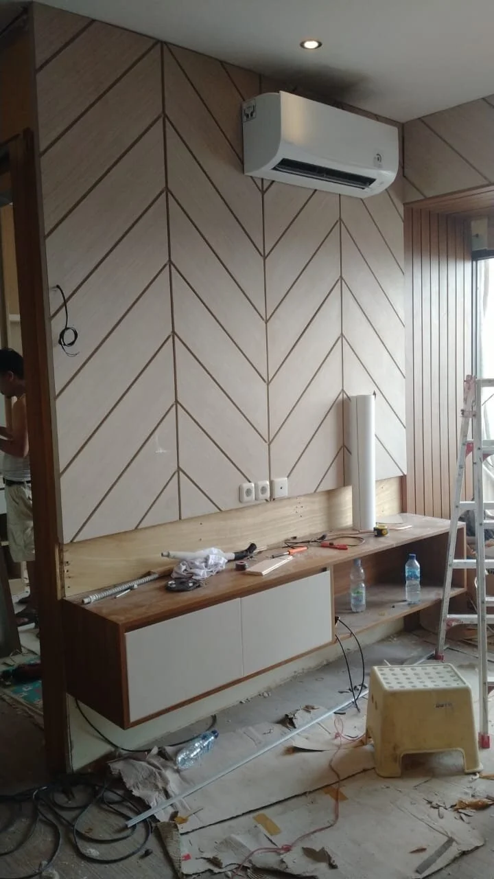
We add necessary things on top of our lists such as wardrobes, sofa, TV Cabinet and Study Desk. See the tour of the apartment yourself!

Mendesain toko retail elektronik dengan banyak kategori

Ketika mendesain toko retail terutama Showroom (toko dengan banyak kategori di dalamnya), beberapa hal fundamental yang harus diperhatikan adalah :

  1. Flow berjalan untuk pengunjung.
    Pastikan space / jarak antar aisle / lorong bisa di masukan trolley / keranjang belanja. Minimal jarak adalah 90cm - 120cm supaya ketika ada pengunjung dari arah sebaliknya berjalan di dalam lorong, tidak bertabrakan dengan pengunjung arah lainnya

  2. Section

    Ketika mendesain showroom elektronik retail dimana banyak kategori didalamnya, layout harus disesuaikan dengan kepentingan users dalam mencari kategori tersebut. Ini mempengaruhi peletakkan produk di kategori berdampingan dengan kategori lain yang semacamnya. Misalnya Kategori Air Conditioner, di dekatkan dengan kategori Air Purifier. Kategori TV di dekatkan dengan kategori Laptop & Handphone. Kategori Kompor didekatkan dengan area Kulkas. Peletakkan kategori berdasarkan fungsi ruangan, memudahkan customer dalam melakukan pencarian barang sekaligus memperbanyak kesempatan pembelian impulsif dalam toko. Misalnya : ketika customer datang untuk membeli Kompor, mungkin mereka akan teringat untuk membeli Cooker Hood dan Blender / Juicer.

    Secara pribadi, saya tidak begitu menyukai pembagian section berdasarkan brand. Karena tidak semua brand memiliki varian produk yang bermacam - macam. Selain itu, ketika sebagai pengunjung, kita mau mencari mesin cuci, kita harus berpindah pindah tempat untuk melakukan perbandingan apabila showroom di bagi berdasarkan brand. Sangatlah merepotkan!

  3. Lighting

    Pastinya kalian sudah tau bahwa toko yang gelap tentu saja tidak “inviting” atau mengundang. Karena itu pastikan toko retail mempunyai penerangan yang cukup dan bagus. Untuk suasana yang hangat, pilihlah lampu Warm White dan lampu sorot (Spot light / bisa memakai track lamp sorot) ketika ingin menghighlight produk penting di display

  4. Simple Design

    Yang perlu di ingat ketika mendesain toko retail adalah “the product is the champion”. Jadi jangan sampai desain interior displaynya mengalahkan produk itu sendiri. Display interior seharusnya menjadi pendukung agar produk terlihat menarik. Karena itu, display interior untuk toko retail diharapkan sesimple mungkin, dengan meminimalisasi penggunaan warna yang Bold / ngejreng supaya tidak mengalahkan aura dari produk yang akan di display. Pilihan warna putih / kayu dapat menjadi pilihan simple minimalis

Contoh Implementasi dari AJS Electronic Showroom di Jalan Panjang, Jakarta Barat

Design & Build : @grahairassinterior

Project Completed : 2020 (1 month design process, 2 months implementation)

Modern Simple Interior when designing Office

When designing office space, as an Interior Designer, we always start by asking the client several questions such as: do you have a design / theme concept from a Principal office outside Indonesia and what percentage of concept similarity must be maintained. We also ask how many users / employees will use the office and how their activities are in the office (do they have a lot of discussions like that in the marketing division) or do they do more work on their own / individual contributions.

All these questions are taken into consideration when designing the space. Because we want to focus on practicality, usability of the space and not focus solely on aesthetic design.

Muhibbah Engineering is a Malaysian Structural consultant who just opened their office branch here in Indonesia and they wanted something simple and straight forward design. Every furniture has to serves its purposes. For this Design, we want to emphasize on aesthetic on the entrance by having a back wall with their logo on it. The carpets theme was to include Muhibbah Green color, and furniture parts are added to help users during their everyday usage. I.e We added glass mat in photocopy center because users are often using the table to do paper cuts with cutter.

Design & Build : @grahairassinterior

Apartment Renovation at Puri Gardenia residence

In one point of time, renovation is much needed to the old place for many reasons such as to return to its former glory, getting rid of previous owner’s vibes, maximizing property value or simply the old furniture does not really match the personality of new owner.

In remodeling this 2 BR apartment, we demolished the old kitchen and its drop ceilings, rebuild the wall panel and took out all the existing wallpaper. Since the apartment might be rented to someone else, we moved the bunk bed out of the apartment and built dual function furniture where the cabinet can be served as Vanity Table, Study Desk, Book shelves and Wardrobe

We are adopting Scandinavian Design with minimalist concept. We preserved the original ceilings, window and doors and keep the original mirror to magnify the effect of larger rooms

Design & Built : @grahairassinterior

Implementation

For Previous condition, please watch this Youtube Channel : https://youtu.be/YTKuSeaoyxU