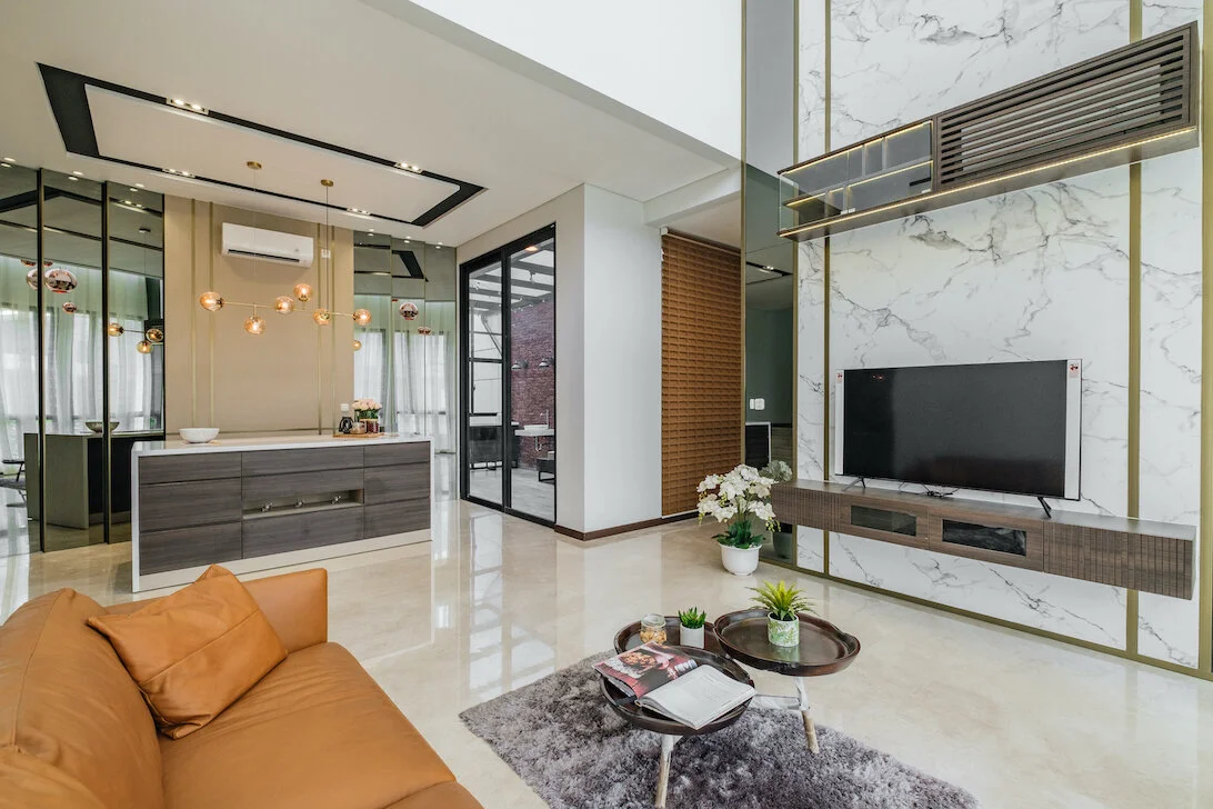
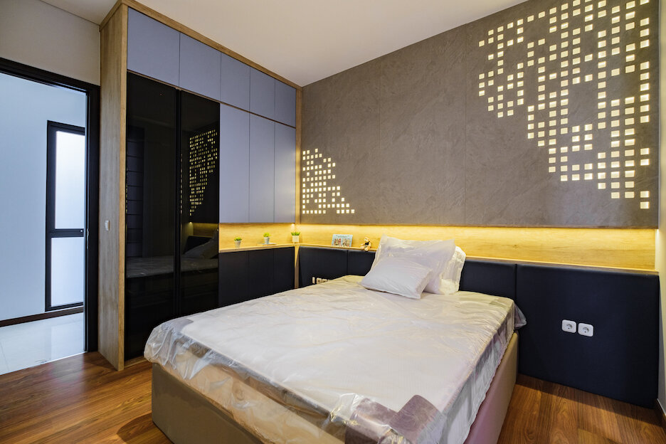
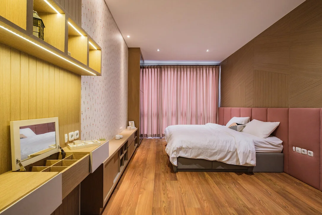
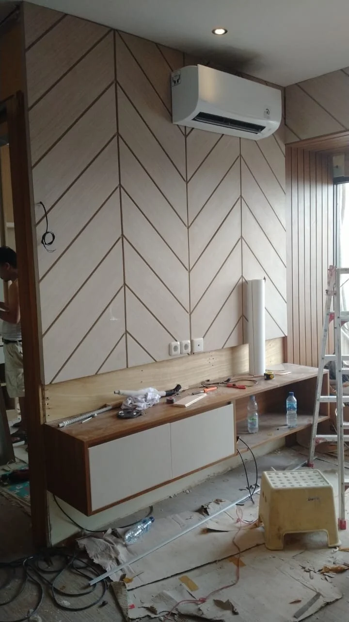
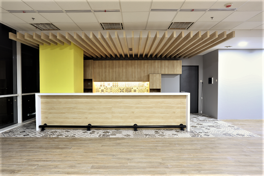
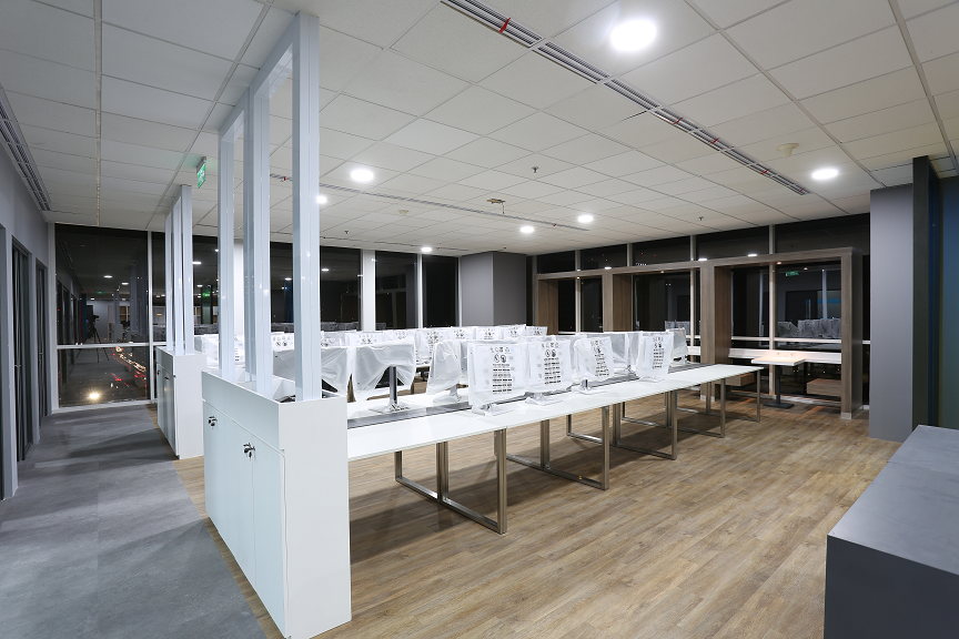
Minimalist Industrial Design for IT Department Bogasari

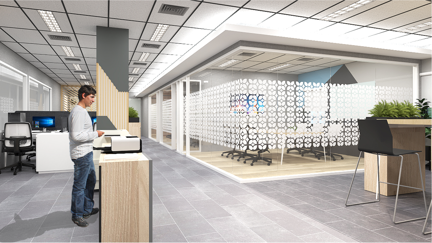
Minimalist industrial design has become increasingly popular in the last few years, and is a great blend of minimalist and functional elements. This trendy alternative design concept for offices has been associated with brave and bold, innovative, and organic organizations.

In the last decade, businesses and start-ups started looking at industrial spaces and warehouses as viable options for their offices. For IT Department in Bogasari, we rejuvenate the existing space and converting them into functional, spacious, and refreshed workplaces. This type of design is an excellent choice for contemporary workplaces and offers a strong yet simple aesthetic

Designed by @grahairassinterior

Designed completed 2021

Check out a virtual office room at video below

Mendesain toko retail elektronik dengan banyak kategori

Ketika mendesain toko retail terutama Showroom (toko dengan banyak kategori di dalamnya), beberapa hal fundamental yang harus diperhatikan adalah :

  1. Flow berjalan untuk pengunjung.
    Pastikan space / jarak antar aisle / lorong bisa di masukan trolley / keranjang belanja. Minimal jarak adalah 90cm - 120cm supaya ketika ada pengunjung dari arah sebaliknya berjalan di dalam lorong, tidak bertabrakan dengan pengunjung arah lainnya

  2. Section

    Ketika mendesain showroom elektronik retail dimana banyak kategori didalamnya, layout harus disesuaikan dengan kepentingan users dalam mencari kategori tersebut. Ini mempengaruhi peletakkan produk di kategori berdampingan dengan kategori lain yang semacamnya. Misalnya Kategori Air Conditioner, di dekatkan dengan kategori Air Purifier. Kategori TV di dekatkan dengan kategori Laptop & Handphone. Kategori Kompor didekatkan dengan area Kulkas. Peletakkan kategori berdasarkan fungsi ruangan, memudahkan customer dalam melakukan pencarian barang sekaligus memperbanyak kesempatan pembelian impulsif dalam toko. Misalnya : ketika customer datang untuk membeli Kompor, mungkin mereka akan teringat untuk membeli Cooker Hood dan Blender / Juicer.

    Secara pribadi, saya tidak begitu menyukai pembagian section berdasarkan brand. Karena tidak semua brand memiliki varian produk yang bermacam - macam. Selain itu, ketika sebagai pengunjung, kita mau mencari mesin cuci, kita harus berpindah pindah tempat untuk melakukan perbandingan apabila showroom di bagi berdasarkan brand. Sangatlah merepotkan!

  3. Lighting

    Pastinya kalian sudah tau bahwa toko yang gelap tentu saja tidak “inviting” atau mengundang. Karena itu pastikan toko retail mempunyai penerangan yang cukup dan bagus. Untuk suasana yang hangat, pilihlah lampu Warm White dan lampu sorot (Spot light / bisa memakai track lamp sorot) ketika ingin menghighlight produk penting di display

  4. Simple Design

    Yang perlu di ingat ketika mendesain toko retail adalah “the product is the champion”. Jadi jangan sampai desain interior displaynya mengalahkan produk itu sendiri. Display interior seharusnya menjadi pendukung agar produk terlihat menarik. Karena itu, display interior untuk toko retail diharapkan sesimple mungkin, dengan meminimalisasi penggunaan warna yang Bold / ngejreng supaya tidak mengalahkan aura dari produk yang akan di display. Pilihan warna putih / kayu dapat menjadi pilihan simple minimalis

Contoh Implementasi dari AJS Electronic Showroom di Jalan Panjang, Jakarta Barat

Design & Build : @grahairassinterior

Project Completed : 2020 (1 month design process, 2 months implementation)

American Classic Apartment style at Rainbow Springs Condovilla

Located in Serpong, this 2 Bedroom Condovilla, this apartment is adapting one of the most popular interior design style in Jakarta : American classic style. The client’s brief was for a transit apartment with a touch of feminity, embracing the spectacular garden view, a design that would draw the attention and feel the genuine feminine in addition into a harmonious whole.

The carefully curated interior responds to the strong architectural envelope, the transitions are so well considered that they are almost seamless. Framed profile form connections between adjacent spaces and make continuous transitions from room to room. The seamless interplay of texture, colour, form and materiality are woven through the interior creating sophisticated and timeless interior.

Project Completed : 2020 (2 months design process)

Designed by @grahairassinterior

Build by @flixtirta

IMPLEMENTATION PHOTOS

Indonesian Interior Style at Elements Apartment

Inspired by Indonesian culture and local heritage, this apartment is designed with perseverance of local indonesian heritage in mind. Batik Kawung patterns are seen as additional touch that are reflected in Room Divider partition and laser cutting patterns for mirrors. As one of the oldest and Indonesian unique materials, Rattan also used in TV Cabinet backdrop wall to give additional accents.

For Furnishings, rattan textures and solid wood are seen throughout the apartment, creating cohesive home reflecting the owner’s taste in Traditional Indonesian heritage

Design & Built : @grahairassinterior

Project Completed : 2019 (2 weeks design process, 1 months implementation)

Bagaimana cara merenovasi ruangan kantor sehingga terlihat lebih besar?

Penataan ruangan sangatlah penting. Oleh karena itu, sebelum memulai proyek, penting sekali untuk mendapatkan brief pengunaan ruangan dari client, baik pengunaan di masa sekarang maupun rencana client untuk masa yang akan datang. Sebagai client, pentingnya melihat rencana ke depan seperti berapa jumlah users / karyawan yang akan di hire, culture perusahaan yang akan dibangun (karena akan mempengaruhi rencana design di open / close office planning), sampai ke pemilihan warna ke arah Brand / Company Identity.

Kantor Building Management Mega Plaza ini luasnya sekitar 92m2 dan mempunyai pegawai sekitar 6 orang. Tantangannya adalah bagaimana menciptakan lobby / area reception yang cukup representative dan ruangan meeting yang cukup lebar dengan space yang sangat limited. Pemilihan furniture sangat mempengaruhi dalam menciptakan kesan luas pada ruangan. Sebelumnya, furniture dengan kayu solid terkesan berat dan besar, sehingga memberikan kesan sempit pada ruangan.

Bandingkan Previous Photo vs After Photo dimana dengan luas yang masih sama 92m2, ruangan terlihat lebih luas dari sebelumnya.

Design & Build : @grahairassinterior

Project Completed : 2020 (1 month design process, 2 months implementation)

Lihat Previous Photo here

After renovation

Rumah Modern Minimalis Kontemporer di Nava Park, BSD

When we enter the empty house for the first time, we are astonished by the high ceiling in the living room and the amount of natural sunlight that enter the houses. Designed to match the personality of the couple owners that wanted the house to be mixed with femininity and masculinity at the same time. The living room was designed to match the Madam Owner style of luxury and femininity as we use Carara marbles textures to give the elegance taste. The Master bedroom is a mixtures of two personality where dark oak wood textures are mixed with Black Marquina marble textures to taste the masculinity elegance.

Upstairs, the rooms are filled for 2 boys and 1 girl bedroom and the transition space are designed for a playful and study room for them. Playing room are designed as additional room for guests with Murphy Bed lift mechanism, makes it simpler and spacious room when its not used

Design & Build : @grahairassinterior

Project Completed : 2020 (2 months design process, 3 months implementation)

IMPLEMENTATION

Scandinavian Interior untuk rumah tinggal

Rasanya ketika mendengar kata Scandinavian style untuk interior rumah tinggal, identik dengan salah satu brand Swedia yang namanya Ikea. Sebagai brand furniture, memang Ikea dirasakan mempunyai ciri khas tersendiri dari Scandinavian Interior Design, yaitu Simplicity dan Minimalis serta fokus pada Functionality (Fungsi) dari furniture itu sendiri.

Style ini sangat populer dan banyak di request oleh client kami, termasuk adalah Rumah Tinggal yang kami kerjakan untuk KOI Village dan Walnut Residence. Ciri khas dari Scandinavian Style ini sendiri adalah Warna khas kayu Birch / Pinus yang terkesan light (Nyaman) , bright (terang), clean (rapi) dan neutral (Netral). Dari sisi furniturenya sendiri, tidak banyak aksen dan terkesan minimalis. Semua furniture sesuai dengan fungsinya tanpa banyak embel embel tambahan seperti aksen klasik.

Scandinavian style adalah style interior yang paling mudah dipadu padankan dengan style interior lainnya seperti Industrial dan ketika di kombinasikan dapat menghasilkan kualitas interior yang lebih warm (hangat). Contohnya, di proyek KOI Village ini, kami menggabungkan aksen industrial seperti cat semen pada dinding dan menggabungkan material seperti rak besi di area dapur & ruang keluarga.

3D Impression KOI Village :

3D Walnut Residence

Modern Simple Interior when designing Office

When designing office space, as an Interior Designer, we always start by asking the client several questions such as: do you have a design / theme concept from a Principal office outside Indonesia and what percentage of concept similarity must be maintained. We also ask how many users / employees will use the office and how their activities are in the office (do they have a lot of discussions like that in the marketing division) or do they do more work on their own / individual contributions.

All these questions are taken into consideration when designing the space. Because we want to focus on practicality, usability of the space and not focus solely on aesthetic design.

Muhibbah Engineering is a Malaysian Structural consultant who just opened their office branch here in Indonesia and they wanted something simple and straight forward design. Every furniture has to serves its purposes. For this Design, we want to emphasize on aesthetic on the entrance by having a back wall with their logo on it. The carpets theme was to include Muhibbah Green color, and furniture parts are added to help users during their everyday usage. I.e We added glass mat in photocopy center because users are often using the table to do paper cuts with cutter.

Design & Build : @grahairassinterior

Apartment Renovation at Puri Gardenia residence

In one point of time, renovation is much needed to the old place for many reasons such as to return to its former glory, getting rid of previous owner’s vibes, maximizing property value or simply the old furniture does not really match the personality of new owner.

In remodeling this 2 BR apartment, we demolished the old kitchen and its drop ceilings, rebuild the wall panel and took out all the existing wallpaper. Since the apartment might be rented to someone else, we moved the bunk bed out of the apartment and built dual function furniture where the cabinet can be served as Vanity Table, Study Desk, Book shelves and Wardrobe

We are adopting Scandinavian Design with minimalist concept. We preserved the original ceilings, window and doors and keep the original mirror to magnify the effect of larger rooms

Design & Built : @grahairassinterior

Implementation

For Previous condition, please watch this Youtube Channel : https://youtu.be/YTKuSeaoyxU

Balinese Interior design in Tropical House at Cibubur Residence

These days, when it comes to Interior Design, Balinese Interior is one of the hottest interior trend People are trying to imitate at their homes. Given so, Balinese Interior design is many times are mixed with a lot of styles such as Industrial design (that we have seen in many cafes) and Luxurious (as we seen in hotels) and it might have transformed and we start to know a concept called Tropical Design.

No doubt, The owners of this residence are fans of Balinese Traditional Design and trying to mixed with latest Tropical Design house with high windows and natural sunlight. To recreate and capture the old balinese style, we are producing furniture mostly from materials that have been known as Indonesian special materials such as rattan, teakwood, eceng gondok (Hyacinth) and Trembesi (Tamarind) wood

As you entered the house, you will be welcomed with solid teak wood furniture in the foyer and Living room with big flower cravings with 7 meter height that was implemented beautifully to capture the Tropical House sense. When you up to 2nd level of the house, you will see the mixed of Minimalist design with Balinese style as mostly 2nd level are occupied with children.

Interior Design & Built : @grahairassinterior

IMPLEMENTATION

To see overall video implementation, head to our YouTube channel :

https://youtu.be/bNrcfgfwIlM

Colgate Palmolive Indonesia

A vibrant new office for Colgate Palmolive. The renovation goal is to modernize the space by combining the reusable material from old office and new material. Focusing on functionality, the design is simple and minimalism with a little bit touch of brand corporate colors for loose furniture.

Design & Built : Graha Irass Interior

Implementation

Arup Indonesia

Insipired by Arup’s values on promoting collaboration and creativity, this new office design located in heart of Jakarta City, represents a complete open space working environment. With three meeting rooms, twos silent rooms, 2 standing areas and 52 open and free workspace, the space fosters openness, free form space and free interactions and collaboration within staff. For meeting rooms, acourette board foam and double glass window are used to reduce the sounds and noise.

Designed by : ArkiLab

Contractor by : Graha Irass Interior

Industrial Scandinavian Interior Design for Apartment St Moritz

Soft minimalism is quickly becoming the latest trend in interior design. It counters the idea that minimalism is cold and sterile and proposes a design style that is clean and contemporary but also warm and livable. This apartment design style is still modernist and minimal but with soft tones, ergonomic designs, and conscious consumerism. This decor is also about simple shapes, natural materials, and warm, earthy colors. It gives your monochrome interior a more subtle and soft look. This concept of soft minimalism goes really well the industrial design style too. Industrial style appreciates the visual appeal that lies within utilitarian objects, metal and wood surfaces, and neutral tones. Industrial decor is simple, subtle and sleek.

Recyclable Plastic Bottle Exhibition with Sejauh Mata Memandang at Plaza Indonesia

Together with Laut Kita production, Sejauh Mata Memandang has brought to you the exhibition of “the effect of plastic usage to our ocean”. The exhibition itself has been designed by Mata Production Agency and within 20 minutes walk, you will be brought to the journey of how our plastic usage has affected our ocean severely. For the store itself, we are consistently using bamboo as a replacement material. And in the ceiling, we installed the ceiling rigid where the used plastic bottles are hung from the top. The store itself will be opened until end of June. ! Its been a pleasure working with this brand, together for our environment!

Store Installation by : Graha Irass Interior

Plastic Bottle Recycle by : Laut Kita Production

Designed by : Mata Studio

American Classic Style for 3Bedroom Apartment at Pondok Indah Residence

With this latest popular trend in Indonesia, We are combining classic american style with touch of modern minimalism interior. Aiming to be a family residence, we are aiming the space to preserving a sense of luxury but still give a comfortable feeling. The colour of gold and wood selections speaks warmth and gives a sense of welcoming feelings

Design & Built by : Graha Irass Interior

IMPLEMENTATION PHOTOS

CHECK THE VIDEO HERE BELOW: